The Challenge: Artforum Art Guide Application
Artforum is the magazine of record for the contemporary art world and holds the unique roles of institution and foremost tastemaker of the industry. Artforum does have a current web application that acts as a mobile art guide but the publication is pushing for a current, intuitive and friendlier app experience.
Role
* Product Designer (independent)
Timeline
* Process duration: 2021 - 2022
Tools
* Adobe XD
* Adobe Stock
* Trello
* Zoom
* Google Suites
Process
* Discovery
* Ideation
* Design
* Usability Testing
Context
I joined as a Product Designer to bridge the gap between design and the live interface. Previously, the app was developer-led, with iOS and Android leads shaping decisions on device parity, accessibility, and user experience.
After a few stakeholder meetings, I realized that there was no source for styles, UI elements, or design patterns. This led to inefficiencies in my design workflows, poor accessibility, and inconsistencies during user testing.
Once I was briefed, I started with a top-level audit of the existing app experience from the ground up.
The Problem
I've observed that Artforum didn't have a consistent and current design library, which is causing inefficient design workflows and poor accessibility in prototypes. What are the processes to build a design library that highlights inclusion and innovation by improving accessibility documentation and reducing wasted time on creating and updating interface elements?
Forming the foundation
Observation
First I had to understand what Artforum currently had designed. After a few conversations, it was evident that while the company did have a minimal Design pattern library, its basic nature resulted in a lot of time being spent on creating new user interface elements from scratch when needed.
Current Artforum Application Design
Inventory
My next task was to inventory the common UI elements used in the current Artforum application. I collected Sketch project files, analyzed the current pattern library, and took screenshots of the app itself.
Research
To establish a sustainable design library, I began this project with some heavy research into design library and UI design best practices. I then referred to Medium product design articles, Apple's Human Interface Guidelines and Google's Material Design Guidelines, along with current design systems and best practices from Mailchimp, Uber, Spotify and Adobe Spectrum.
Establishing the Structure
Per the stakeholders' request, I structured the design system using Global CSS Styles to ensure consistency across platforms while allowing flexibility based on project scope.
Final Design system
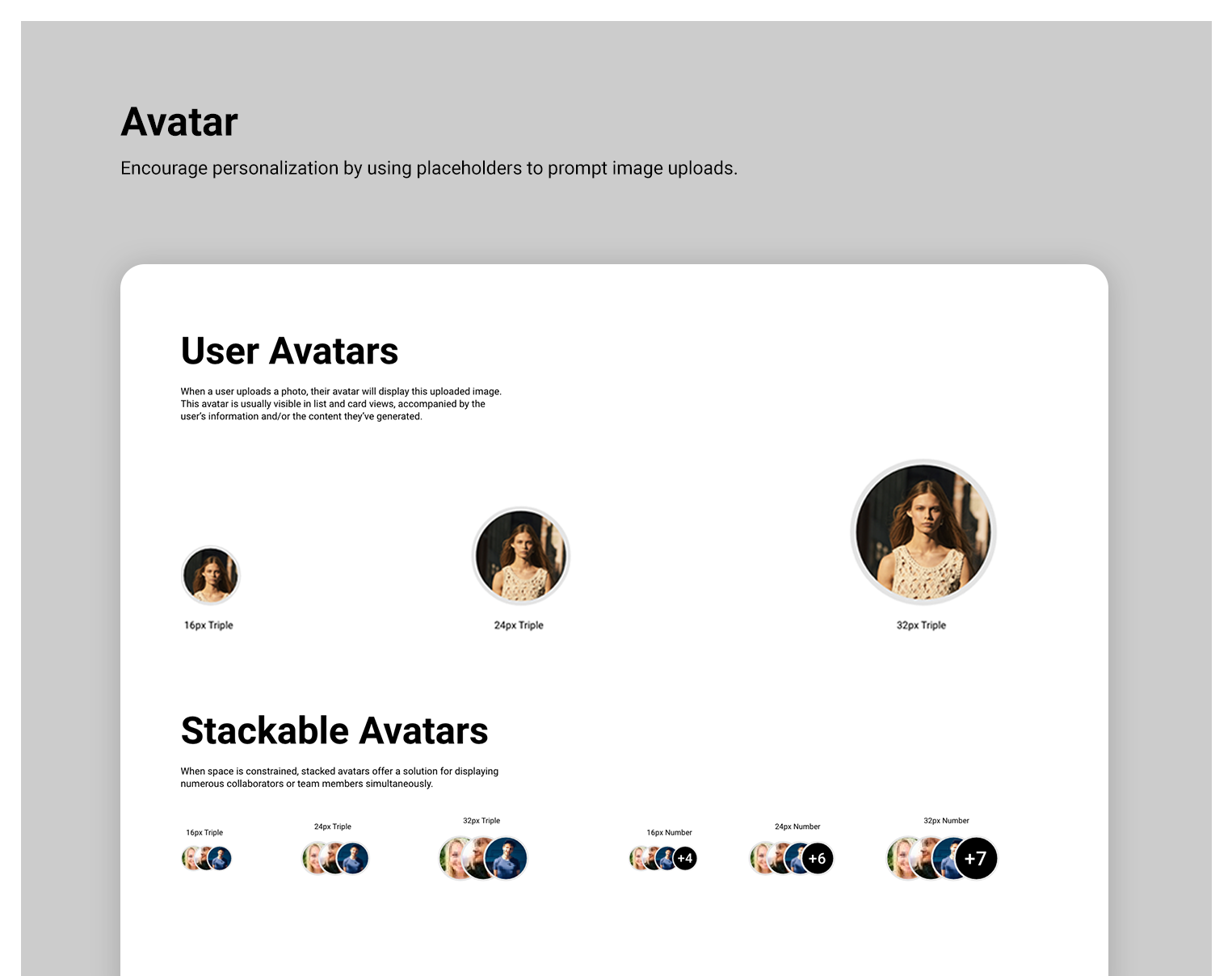
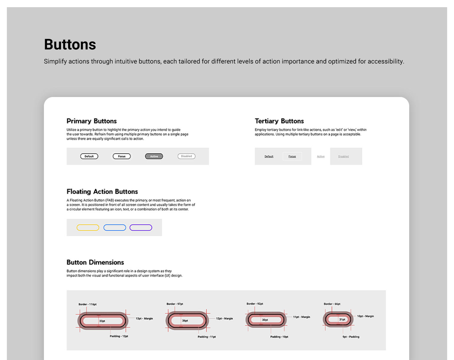
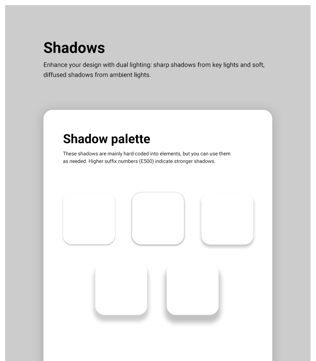
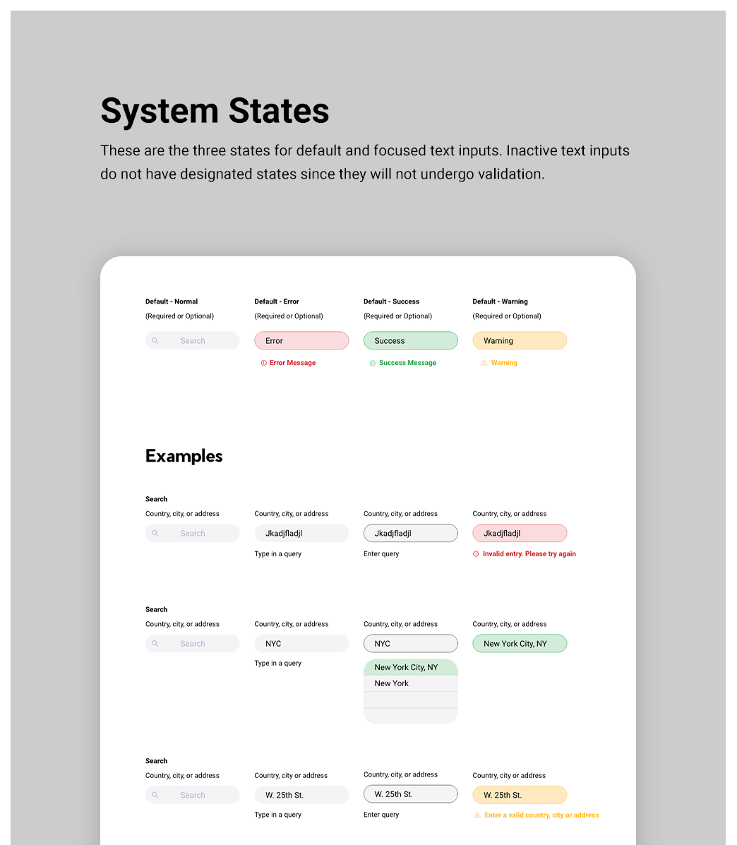
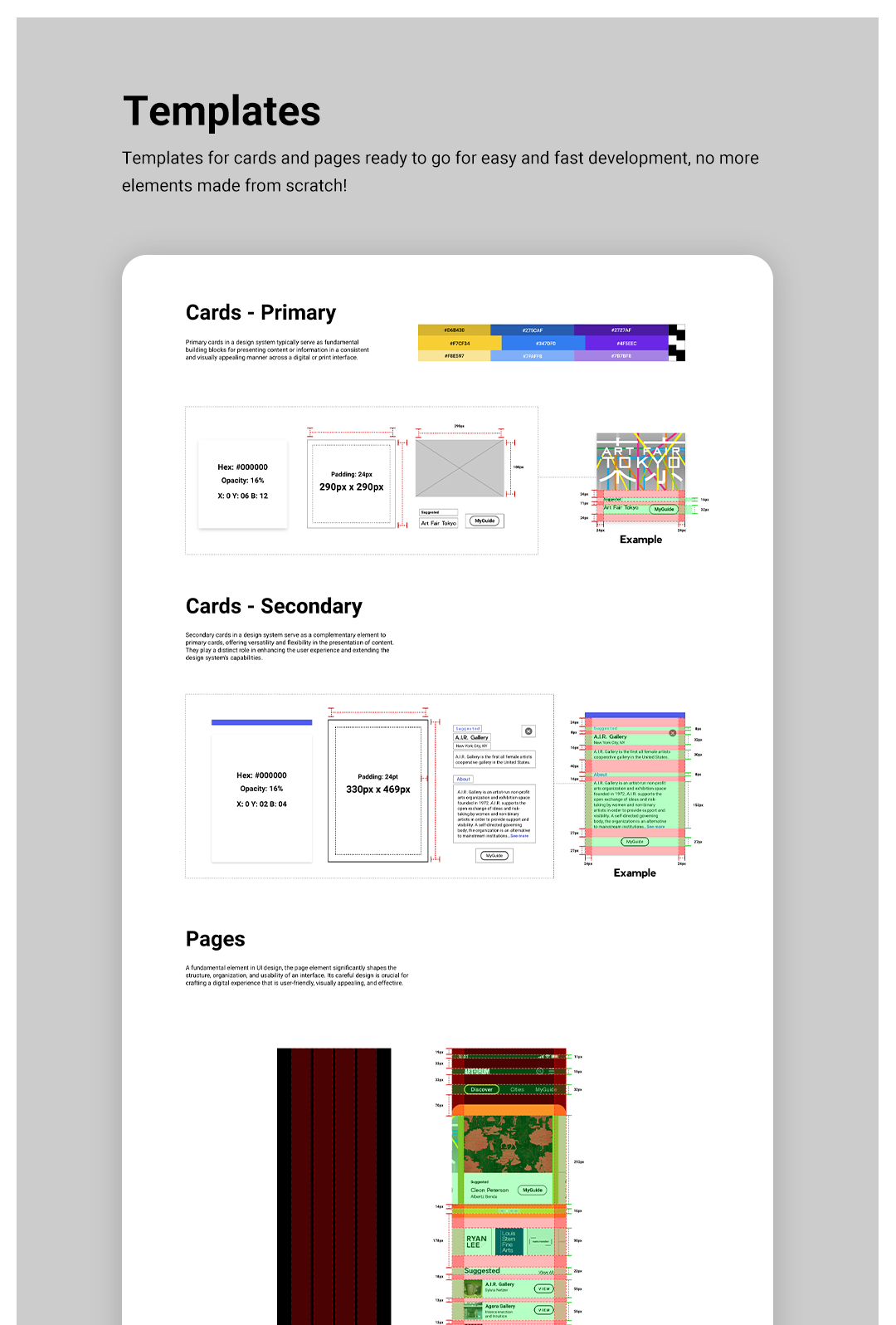
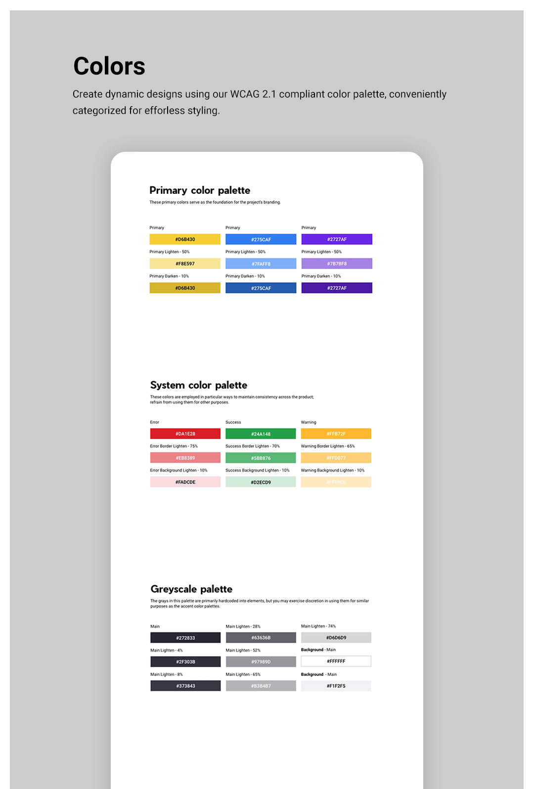
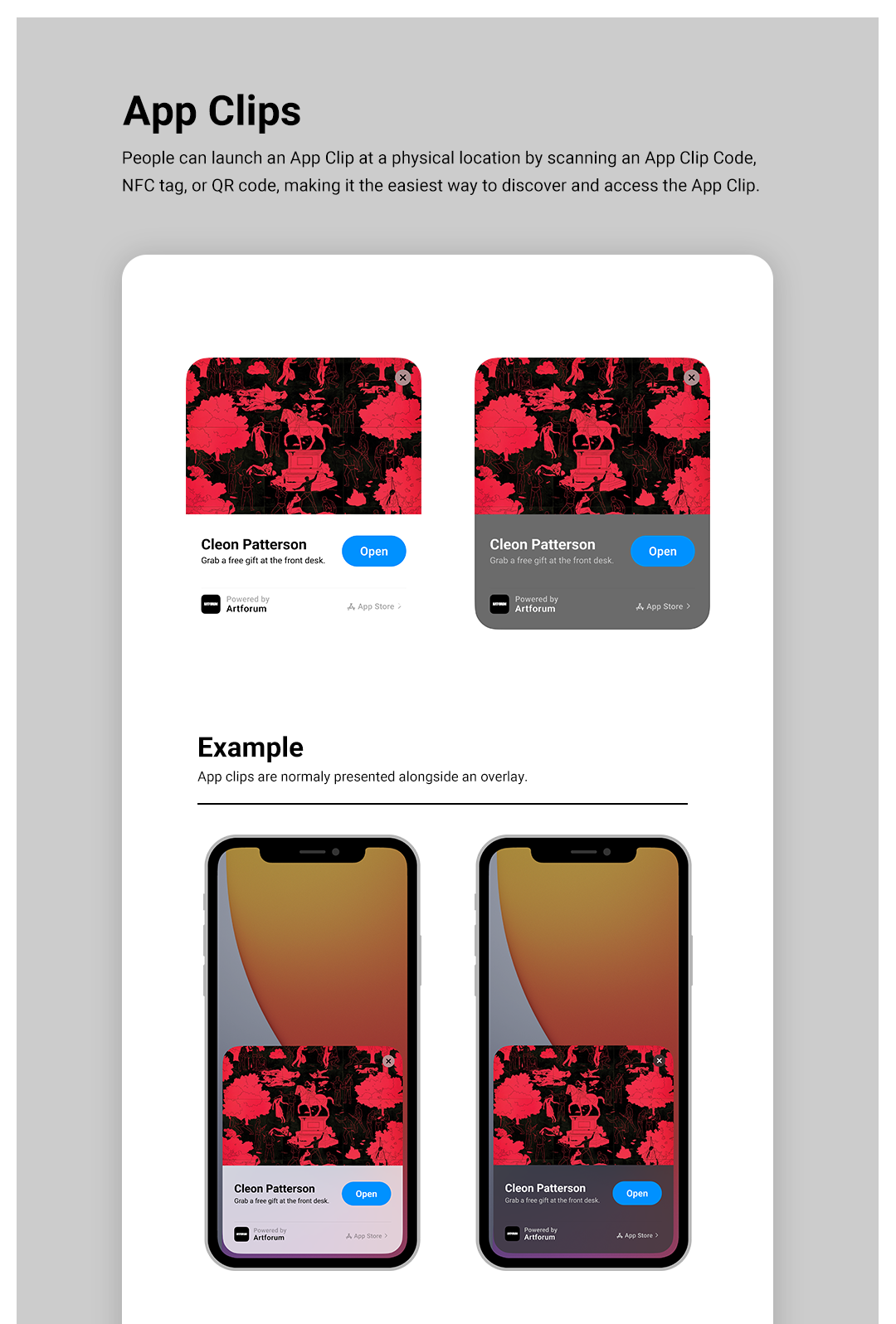
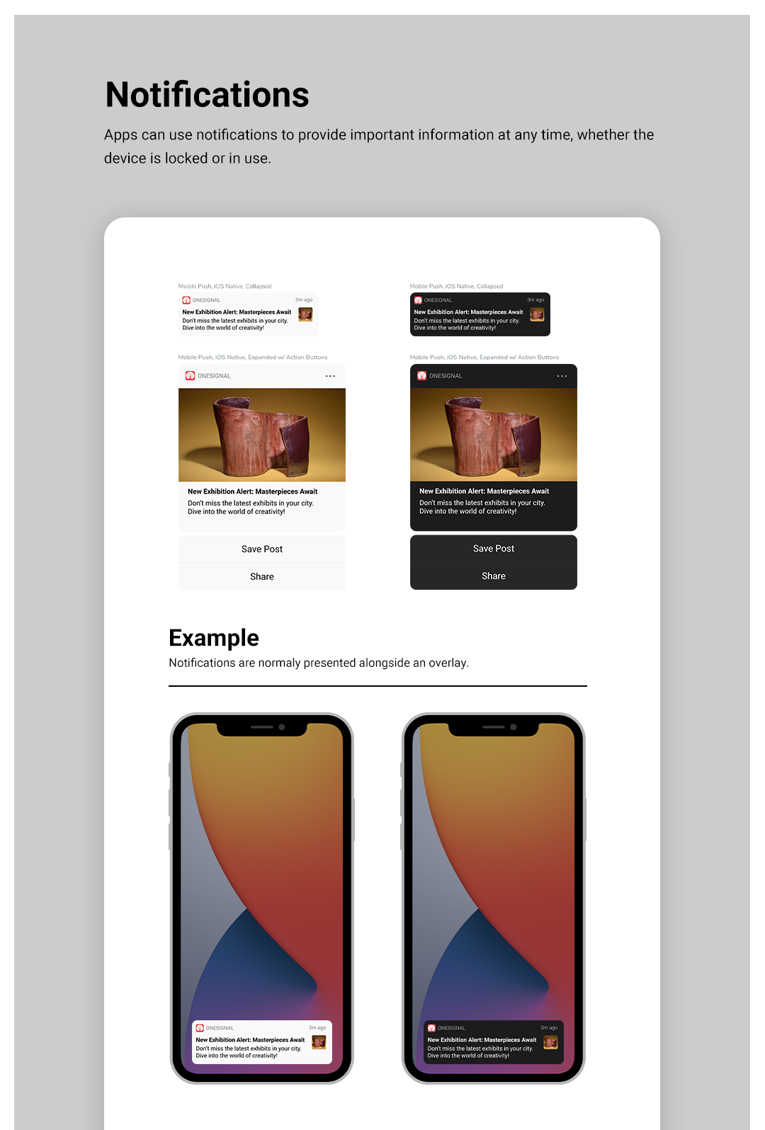
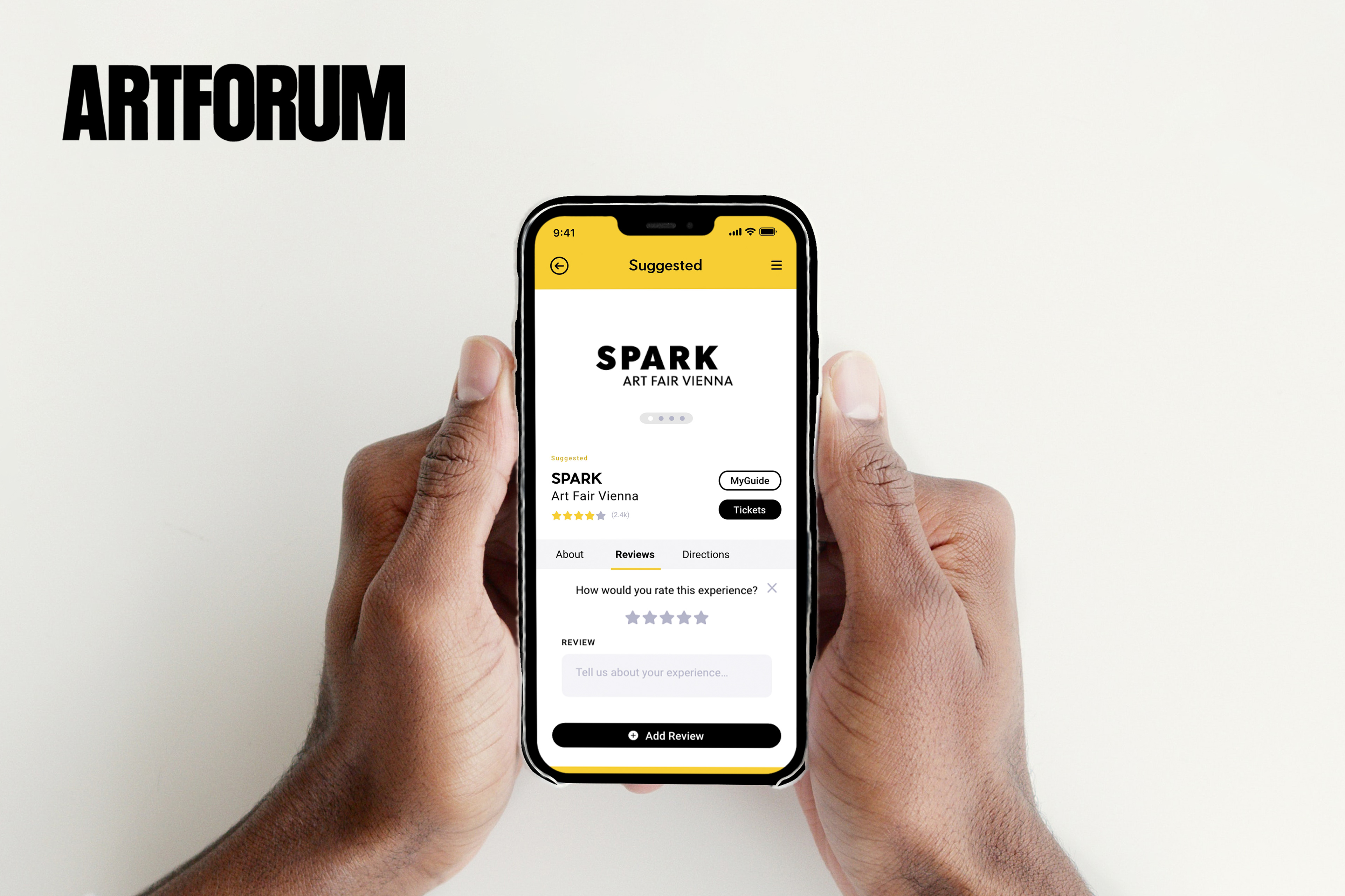
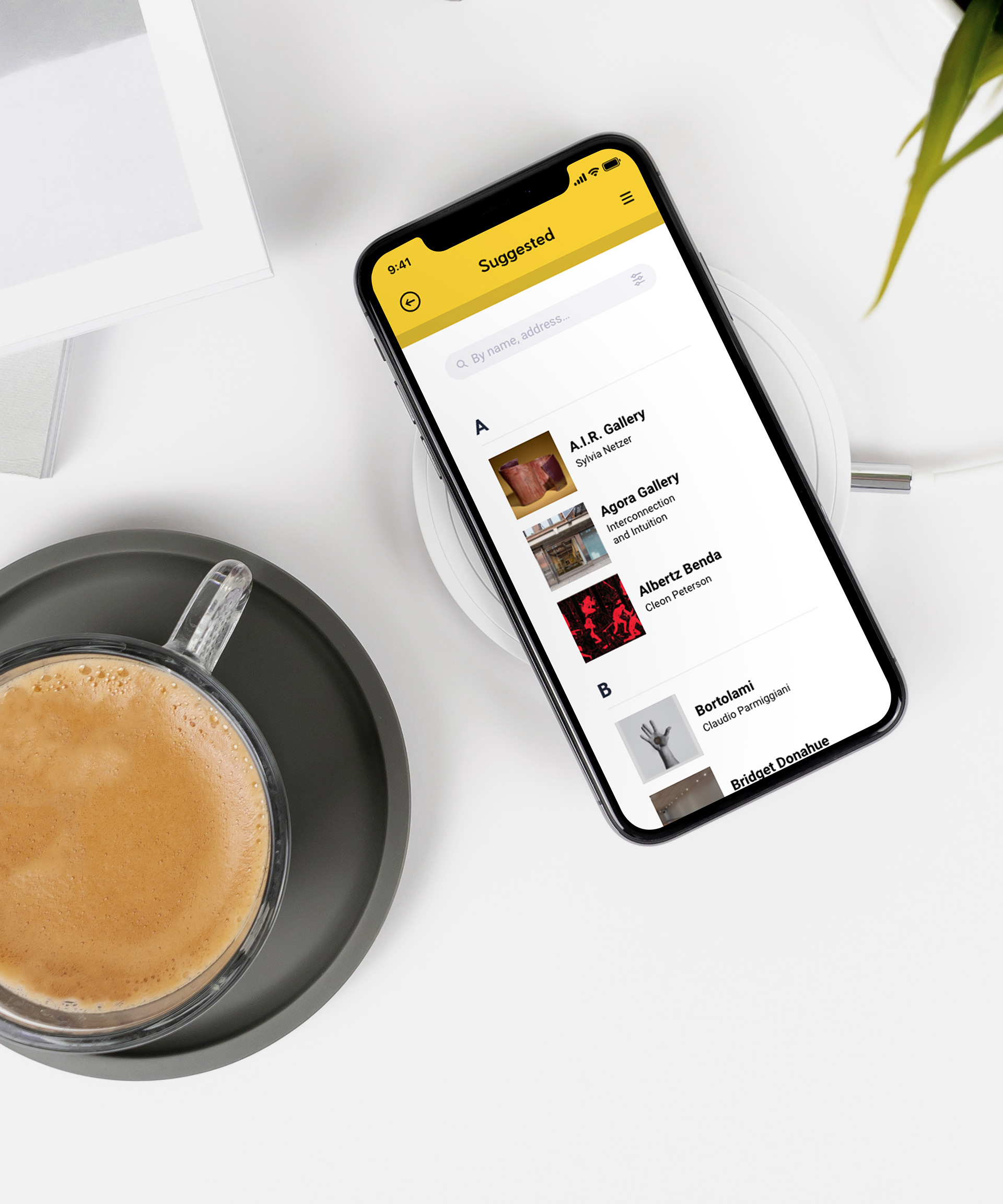
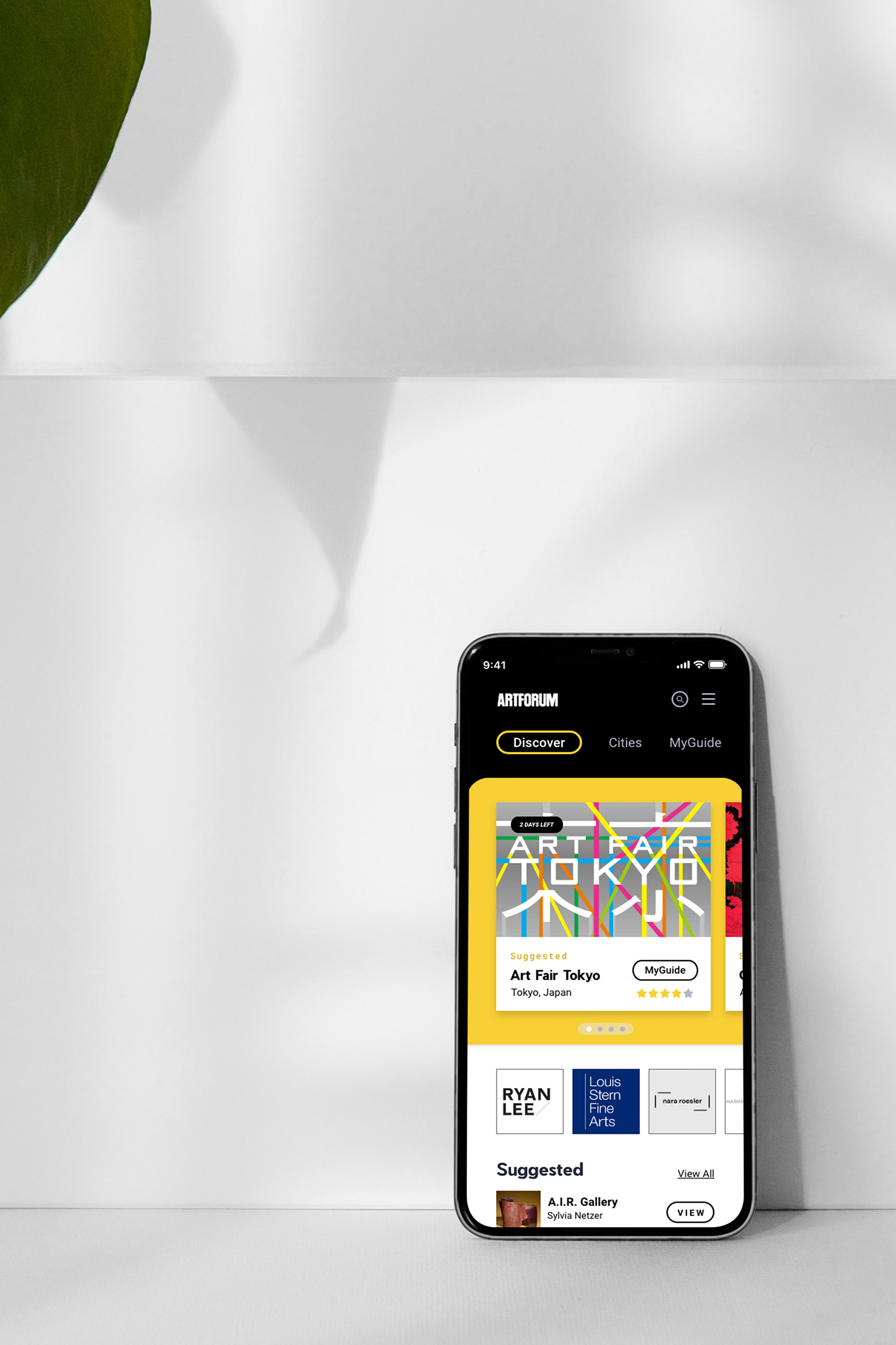
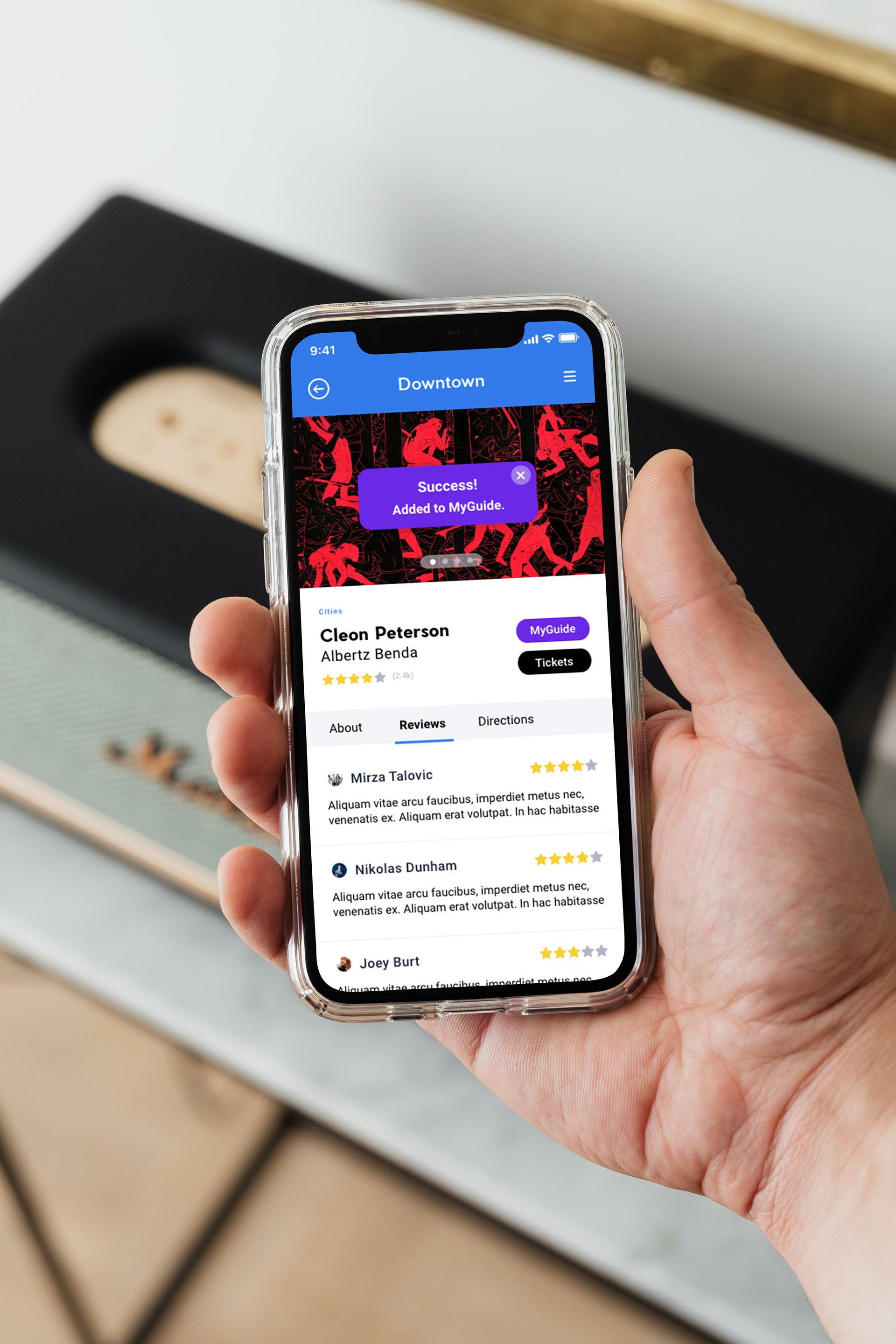
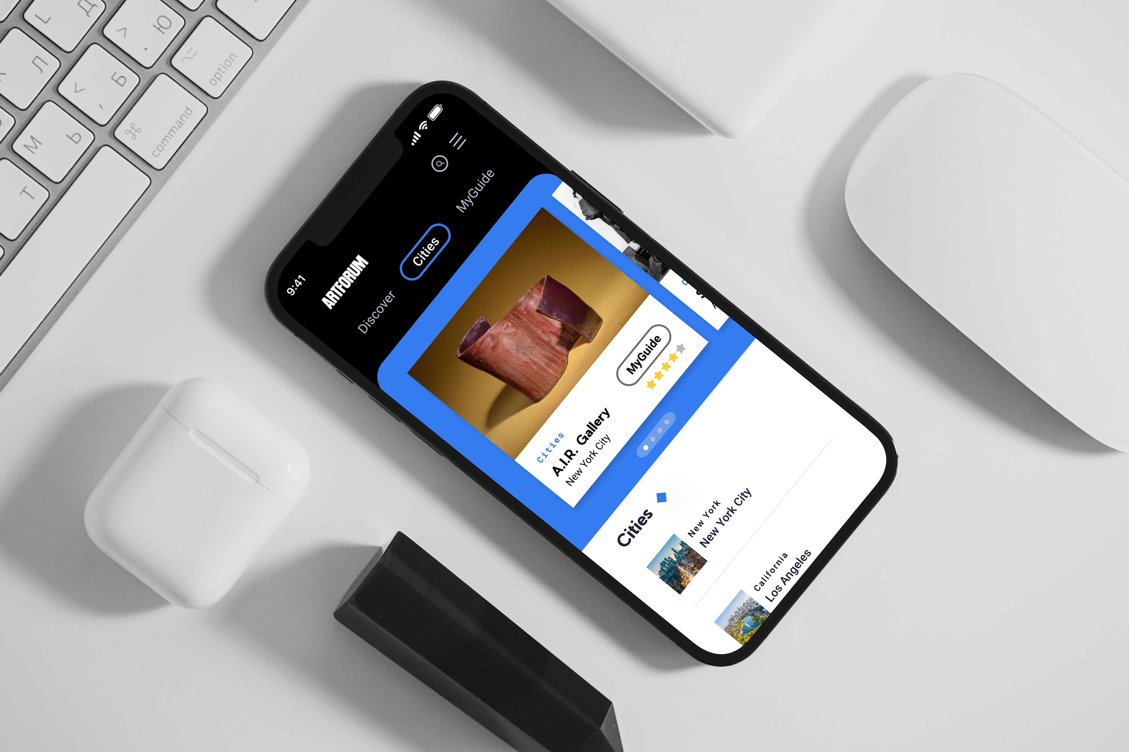
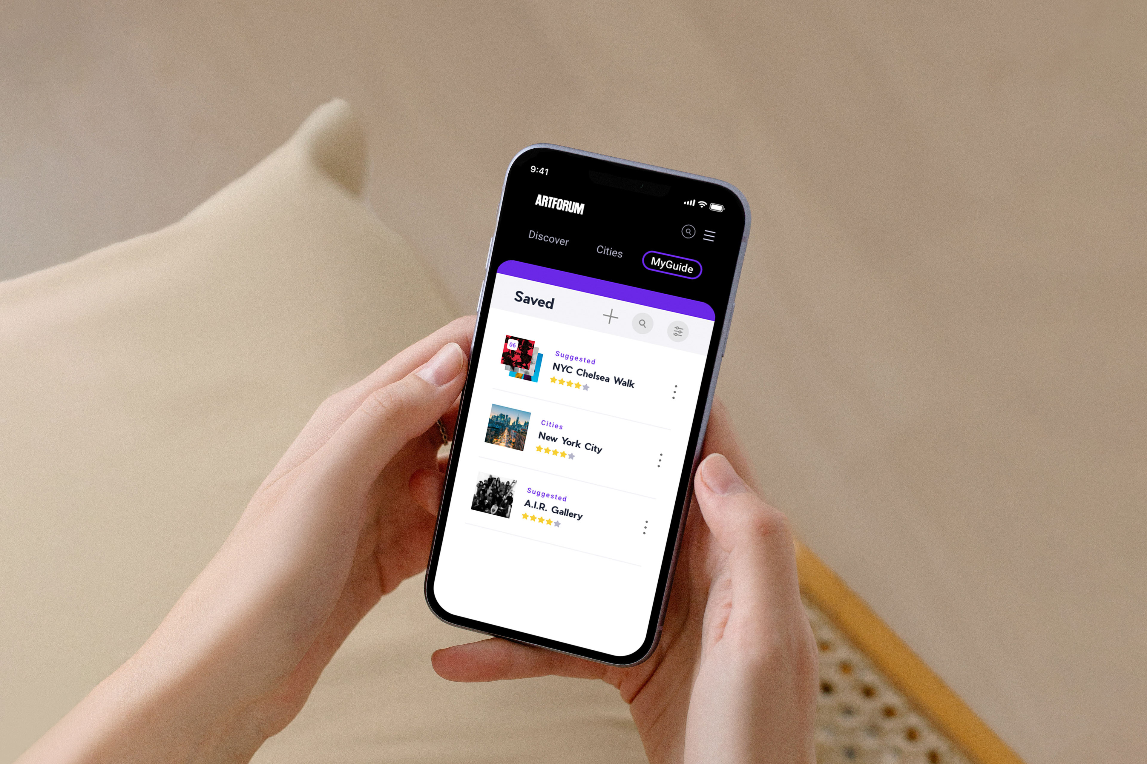
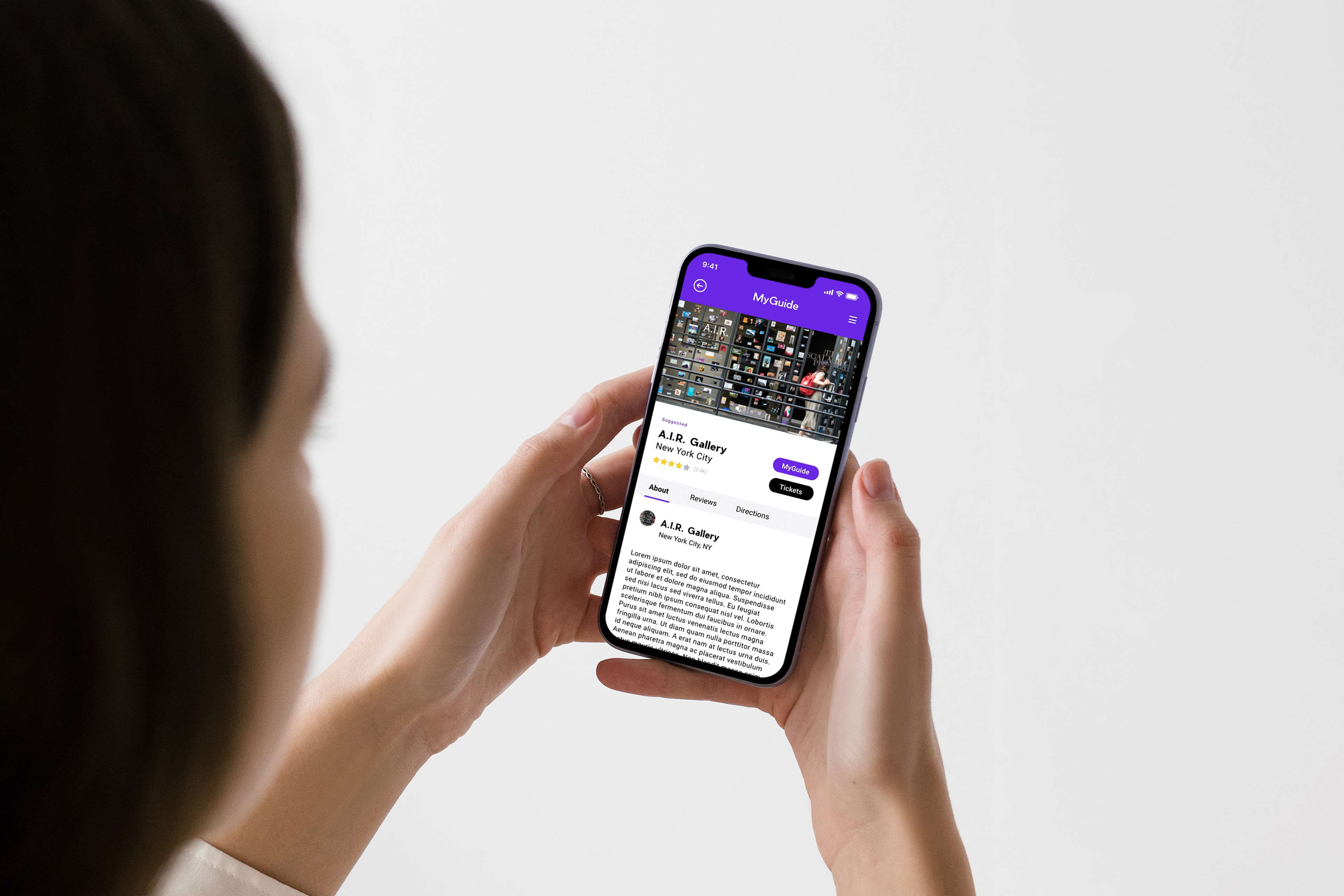
Final designs using the new design system elements.
Key takeaways
Best Practices
Emphasizing quality in crafting the core components of the design system proved immensely beneficial. By establishing a structured hierarchy and diversifying the range of adaptable design elements, selecting components to match varied design needs became streamlined.
Design Your Own Product
When developing a design system, the pursuit of 'optimizing the library' may inadvertently compromise usability. Incorporating my custom components into my design processes enabled me to pinpoint and rectify any unintuitive or cumbersome aspects.
